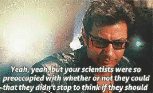
Dr. Ian Malcolm said it best, lounging in his leather jacket with peak 90s Goldblum-anity:
“Your scientists were so preoccupied with whether or not they could, they didn’t stop to think if they should.”
That line isn’t just about resurrecting prehistoric murder lizards. It’s the perfect mantra for modern product teams.
We’re living through a new golden age of tech hype. AI is everywhere, VR is making a comeback (again), and every other week someone wants to strap blockchain onto a fridge. The temptation is to build simply because you can.
But here’s the UX truth: just because you can ship a shiny new feature doesn’t mean it’s valuable, usable, or remotely ethical. And if you want proof, look no further than Isla Nublar: the greatest minimum viable product launch fail of all time (apart from Juicero).
The Park Is the Product (and Nobody Tested It)
Jurassic Park was essentially a beta test with actual velociraptors and sweet jeeps.
No user interviews. No pilot runs. Not even a quick survey at the visitor centre like, “On a scale of 1 to ‘eaten alive’, how safe did you feel today? - just Richard Attenborough with his dreams and a stick of amber.
The park’s creators assumed people would be dazzled. They forgot that delight only matters if you can survive the experience.
UX lesson: A big idea without validation isn’t innovation. It’s chaos with better branding.
Ignoring Edge Cases = There’s a raptor in the kitchen, what am I gonna do?
Hammond’s team designed for the “happy path”: dinosaurs behind fences, guests in jeeps, children definitely not being stalked in a kitchen.
But users—like velociraptors—rarely follow the script. They click the wrong thing, ignore instructions, and somehow break everything you thought was unbreakable.
UX lesson: The real test of a product isn’t when everything works as expected. It’s when someone goes off-piste and still makes it through without rage-quitting.
Chaos Theory & User Behaviour
Ian Malcolm’s chaos theory warned that complex systems always unravel in unpredictable ways. In the park, it took one inconvenient power outage to turn “wow” into “well, shit.”
Products are no different. A distracted user, a dodgy Wi-Fi connection, or a cat sitting on a keyboard can collapse your perfectly rehearsed flow.
UX lesson: Prototype early, test often, and expect your users to do things you never imagined. Embrace the chaos—it’s free research.
The Illusion of Control (a.k.a. Dino Fences)
On paper, those electrified fences looked unbreakable. Until, you know, the electricity stopped working.
This is what happens when you design rigid systems with no graceful way to fail.
UX lesson: Good design assumes failure. Build resilient flows, clear error states, and recovery options. If your system goes down, don’t leave your users staring blankly into the jungle—give them a map out. When testing be clear to users what the environments are - and if they do go off piste, be prepared to follow them.
The Human Factor (Dennis Nedry = Bad UX)
Dennis Nedry locked an entire park behind a “magic word” because… why not? (Also: don’t trust disgruntled team members with your entire infrastructure.)
That cheeky little “Ah ah ah, you didn’t say the magic word!” was funny until people were being eaten.

UX lesson: Internal UX matters. A clunky dashboard or confusing back-office tool can cause more damage than a buggy customer app. Don’t forget the people behind the curtain. The team are stakeholders in your success, they have the power to bring everything down from the inside, so be nice. Maybe buy them some snacks.
Ethics of UX (Should You Make a Dinosaur?)
The real question wasn’t “Can we?” but “Should we?”
Dinosaurs were cool. But they weren’t safe, sustainable, or remotely considerate of human survival rates.
The same goes for tech. You can build facial recognition that tracks everyone at a festival, but should you? You can design sticky features to keep people doom-scrolling, but what’s the cost to mental health?
Just because the CTO has a ‘brand new idea’ (that they’ve secretly been mulling over for 6 months) of making a brand new app (do you need an app?), doesn’t mean you need to jump straight on to it.
UX lesson: Tech isn’t neutral. Ask: Who benefits? Who’s excluded? What’s the worst-case scenario if this goes wrong? Is it a worthwhile spend of time and resources?
Conclusion - UX finds a way
The downfall of Jurassic Park wasn’t DNA. It was UX.
Hammond had the tech, the budget, and the ambition. What he didn’t have was user research, foresight, or a plan for when things inevitably went sideways.
Great UX isn’t about spectacle. It’s about building responsibly—for real people, in messy real contexts. It’s about knowing when to say “no” to features that look impressive but will bite you later.
Don’t wait until your product escapes the paddock. Test it whilst its safe.